Quick post with an update on the commission study. Still deciding on colors for grasses! This study doesn't have to be perfect, just a roadmap for the larger 24" x 30" painting. The study is 16" x 20" acrylic on canvas.
Showing posts with label WIP. Show all posts
Tuesday, August 7, 2012
Monday, August 6, 2012
WIP: Commission using black and white photo
This is a study for a 24" x 30" commission. We only have a black and white photo as reference. It is liberating to choose any colors, but at the same time challenging!
I have to resolve a few areas before we proceed with the larger painting. I have to change some colors and define the upper right area above the fence. I need to go back in all over and refine a little bit, add a little more detail to the faces, horse, and the fence.
Stay tuned for more progress on this piece! Thanks for reading.
Bethany
Labels:
Acrylic,
commissions,
farm,
Figurative,
Landscape,
WIP
Monday, March 26, 2012
WIP: Shady Spot
Here's a small piece I started today to take a break from a larger project. From photos I took last spring at the UNC Botanical Gardens.
It's so refreshing to switch gears! I'll post an update when it's finished.
![]() |
| Shady Spot 9" x 7" oil pastel on board |
It's so refreshing to switch gears! I'll post an update when it's finished.
Tuesday, March 20, 2012
Mordecai Park and Meet My Pastels
I've been working on the Mordecai Park painting (talked about here), and have some progress to share. I'll begin introducing you to my pastel collection in this post, too.
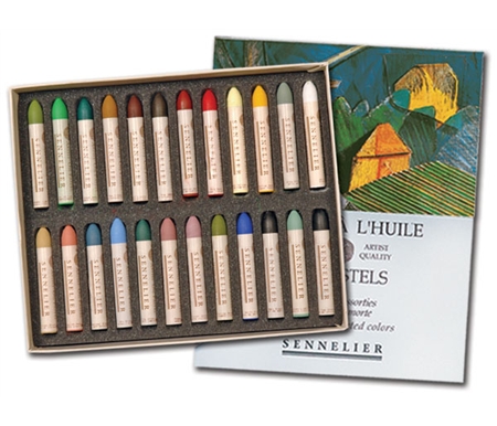
I've adjusted some proportions and am slowly filling the paper with color! I've been using my La Grande Sennelier oil pastels on this 22" x 30" piece. La Grande pastels are eight times the size of Sennelier's smaller pastels, which is very nice when working large scale.
I am noticing that my 36 color set is lacking in some of my favorite shades from the smaller sized pastel. Most noticeably I'm needing Sap Green 087, Violet Alizarin Lake 076, Sky Blue 226, and another White. My white La Grande finally disappeared, as it's my favorite white oil pastel and it gets used so much!
I've had my precious La Grande set for 6 or 7 years. It was my first major investment in oil pastels. Since then I've been supplementing my collection with the smaller sized Sennelier oil pastels. I've also been trying out Erengis and Gallery Extra Soft oil pastels, both of which are good to layer underneath the more creamy (and expensive) Senneliers. To give you an idea of cost, individual smaller sized Sennelier oil pastels cost about $2-3 each and the La Grandes are about $7-8 each. These are not your grade school pastels!
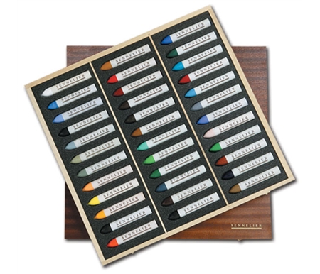
I'd love to add some Holbeins and Neopastels to the mix. My dream would be to add a Holbein 225 piece boxed set, which includes 5 shades of each color. They aren't making these anymore, so my time is wasting away before these will be all gone!
If you're looking for more information on oil pastel brands, check out Robert Sloan's site. He offers great reviews and information about oil pastel brands and materials. I'll be sharing more about my experiences with oil pastels in future posts, so stay tuned!
Don't miss a post! To get the latest posts delivered to your inbox, please enter your email address on the right side of this page under "Follow by Email". You can also like Bethany Bryant Art on Facebook, where I share info between blog posts, news, and ideas for paintings.
![]() |
| Mordecai Park 22" x 30" Sennelier oil pastel on Arches Cover |
I've adjusted some proportions and am slowly filling the paper with color! I've been using my La Grande Sennelier oil pastels on this 22" x 30" piece. La Grande pastels are eight times the size of Sennelier's smaller pastels, which is very nice when working large scale.
![]() |
| regular oil pastel versus the La Grande buy them here |
I am noticing that my 36 color set is lacking in some of my favorite shades from the smaller sized pastel. Most noticeably I'm needing Sap Green 087, Violet Alizarin Lake 076, Sky Blue 226, and another White. My white La Grande finally disappeared, as it's my favorite white oil pastel and it gets used so much!
I've had my precious La Grande set for 6 or 7 years. It was my first major investment in oil pastels. Since then I've been supplementing my collection with the smaller sized Sennelier oil pastels. I've also been trying out Erengis and Gallery Extra Soft oil pastels, both of which are good to layer underneath the more creamy (and expensive) Senneliers. To give you an idea of cost, individual smaller sized Sennelier oil pastels cost about $2-3 each and the La Grandes are about $7-8 each. These are not your grade school pastels!
I'd love to add some Holbeins and Neopastels to the mix. My dream would be to add a Holbein 225 piece boxed set, which includes 5 shades of each color. They aren't making these anymore, so my time is wasting away before these will be all gone!
| Holbein 225 piece set |
Don't miss a post! To get the latest posts delivered to your inbox, please enter your email address on the right side of this page under "Follow by Email". You can also like Bethany Bryant Art on Facebook, where I share info between blog posts, news, and ideas for paintings.
Wednesday, March 7, 2012
Painting Local Landmarks: Mordecai Park
I've started what I hope will be a series of pieces based on local landmarks. The first of these will be based on Mordecai Historic Park.
Here is the progress of the first piece:
The next step is to go back and correct perspective, correct some layout problems, and lay down more color! I'm kind of wishing that I had primed the paper with my favorite terracotta Colourfix pastel primer so that there were some pops of color peeking through. But I think that the white ground will make for a brighter sky and white in the central building.
Stay tuned for updates! I have several other images from Mordecai that I'd like to paint, perhaps a bit smaller than this one.
Here is the progress of the first piece:
- Reference picture I took with my Nikon D40
- Thumbnail sketch, about 5" x 7". Note that I overlapped the left and center buildings. The space between the buildings was distracting!
- Begin painting on Arches Cover primed with clear Colourfix primer, 22" x 30." Sketch/underpainting with Lyra water soluble pastels
- Current progress. First layer of Sennelier and Erengi oil pastels.
The next step is to go back and correct perspective, correct some layout problems, and lay down more color! I'm kind of wishing that I had primed the paper with my favorite terracotta Colourfix pastel primer so that there were some pops of color peeking through. But I think that the white ground will make for a brighter sky and white in the central building.
| 22" x 30" Oil Pastel on Arches Cover |
Stay tuned for updates! I have several other images from Mordecai that I'd like to paint, perhaps a bit smaller than this one.
Thursday, January 19, 2012
WIP: Little Lucy
Here's an oil pastel portrait that I am close to finishing...
I still have some work to do on the hands and eyes, some shading in the cheeks, and a little more with the background. It's hard to stop, but I think she's almost there!
Stay tuned for the finish! I'm also working on a kitty portrait and will have a post on that this weekend.
PS: Did you notice that I reworked the look of my blog? A cleaner look for the new year. I have so many goals for 2012, and we're almost to February already...yikes!
Interested in commissioning a portrait? See details at my Etsy shop.
| 11" x 14" oil pastel on Arches Cover primed with clear Colourfix |
I still have some work to do on the hands and eyes, some shading in the cheeks, and a little more with the background. It's hard to stop, but I think she's almost there!
Stay tuned for the finish! I'm also working on a kitty portrait and will have a post on that this weekend.
PS: Did you notice that I reworked the look of my blog? A cleaner look for the new year. I have so many goals for 2012, and we're almost to February already...yikes!
Interested in commissioning a portrait? See details at my Etsy shop.
Saturday, January 7, 2012
Commissions Step-by-Step
Some of you might wonder how I go about painting a commissioned piece. Here's a step by step run down of my process, shown here is a recent painting, "Virginia Farm."
I start with a good reference picture from the client.
The client asked for some of the trees to be removed from the front of the house so we can see more of the house up on the hill. Luckily, they got another close-up of the house so I could see what was behind those trees!
We decide on a 12" x 16" oil pastel painting, and I begin with a basic sketch. (Send layout to client for approval/feedback)
I lay down a layer of oil pastel on board primed with pastel primer. (Send progress picture to client for feedback)
When client replies that all is on track, I go in with more pastel to refine/blend.
I am constantly editing, adjusting colors, adding detail, and stepping back to see how things are looking. At this point in the painting, the trees in the background and in the middle of the hill are making me a bit crazy. There is not much vibrancy in the trees, so I need to enhance the colors and punch them up a bit. Now is a good time to take a breather for a day (send progress pics to client), and come back with fresh eyes. Also, the pastel needs to dry and "set up" a bit so the next layers will go over and not blend with the previous layer.
For more about commissions and pricing, visit my Etsy shop or see the Commissions section on this website.
Happy weekend!
I start with a good reference picture from the client.
We decide on a 12" x 16" oil pastel painting, and I begin with a basic sketch. (Send layout to client for approval/feedback)
I lay down a layer of oil pastel on board primed with pastel primer. (Send progress picture to client for feedback)
When client replies that all is on track, I go in with more pastel to refine/blend.
I am constantly editing, adjusting colors, adding detail, and stepping back to see how things are looking. At this point in the painting, the trees in the background and in the middle of the hill are making me a bit crazy. There is not much vibrancy in the trees, so I need to enhance the colors and punch them up a bit. Now is a good time to take a breather for a day (send progress pics to client), and come back with fresh eyes. Also, the pastel needs to dry and "set up" a bit so the next layers will go over and not blend with the previous layer.
I have added highlights to the trees and some pops of color to make it more exciting. I put in more shadows around the distant structures and add detail around the barn in the foreground. My mom, a talented painter and my best friend, comes over and suggests that I push the trees on the left up so they break up the bar of blue sky. I agree and take another break, and then go in for the last round...
I'm pretty pleased with everything and stop before I think I'm finished. I've learned that I'll never be 100% satisfied, but there is a point where you have to quit before you make a mess and muddy it all up! I send the client a final version for approval.
They are happy and have no changes, so the final step is to sign the painting and take a good photo in natural light with my good camera!
| finished oil pastel painting |
| again, the reference photo for comparison |
I hope you enjoyed my painting demo! It's so much fun taking a photo and making a painting for a client... hopefully this was a memorable Christmas present.
For more about commissions and pricing, visit my Etsy shop or see the Commissions section on this website.
Happy weekend!
Monday, November 28, 2011
WIP: Pet Portrait Commission
This is a work in progress... a commission from two different photographs.
| Trey and Wilson 5" x 7" oil pastel on board |
If you're looking to commission a pet portrait, please check out the Black Friday-Cyber Monday sale in my Etsy shop! All prices are automatically discounted 10% through midnight tonight (Monday, November 28).
There are lots of Etsy sellers offering discounts, so take advantage and shop handmade this holiday season! For shops offering sales for this weekend, add "cyber monday" or "black friday" to your search terms.
I'm also working on a few winter scenes for an upcoming show...look for a post on those soon!
Sunday, November 6, 2011
WIP: Little Girl Custom Portrait
So far I'm loving how this custom portrait is turning out!
She is an adorable subject, so it's hard to go wrong! Painted from a client's photograph. I have some major work still to do on her, like lower the eyes and tweak the chin and neck. Probably have another 2 hours of work to do still!
I also am working on a custom pet portrait in acrylic, and just finished another pet portrait in oil pastel. The holidays are getting near, and I'm loving creating some really special gifts!
I'll post the pet portrait that I just finished later in the week, since it's a birthday gift and I don't want to ruin the surprise.
Stay tuned!
Monday, September 12, 2011
WIP: Apex Farmhouse
Here's a painting I've been working on for another show. This is for the upcoming juried show at the Halle Cultural Arts Center of Apex. View event information here.
| Apex Farmhouse 16" x 20" acrylic on canvas |
I started with a wash using water soluble pastels on canvas primed with Colourfix in terracotta... I was planning on a light layer of acrylic with some touches of oil pastel.
Next, I laid down the acrylic paint with a palette knife... this took about 2 hours.
I worked on it another 30-45 minutes last night and made myself stop here...
Not sure how much more I want to work on it. I'm afraid it will get too blended or have too much detail, and it won't look as fresh and spontaneous. What do you think?
I might just finish around the windows on the left side of the house, add some more Fall color to the tree on the left, and add a little more green in the shadow above the shed. Oh, and I think I want more yellow in the meadow. That's all ;)
Maybe I'll limit myself to another 20 minutes!
Stay tuned... for the latest details, you can see my images and what I'm working on by following me on Twitter : ArtbyBethany. (See the Twitter feed on the right bar on this page!). ------->
Friday, May 20, 2011
WIP: Lhasa Help in the Garden
This week I've been working on a fun new piece...flowers and an adorable puppy!
I painted this with Sennelier oil pastels on a sand colored rag board. I continued experimenting with underpainting in water soluble pastels. Instead of priming the entire board in a darker color (my usual pastel primer in terracotta or aubergine), I toned the board with water soluble pastels and made a wash with water to begin to lay in the colors of the piece.
This technique helped me leave more texture from the pastel, and avoid blending the colors too much. I have a tendency to "smoosh" (a technical term, I'm sure) the colors around too much and make for a muddy painting. Often I do the same with paints, scumbling like crazy and wearing down my paintbrushes.
I painted this with Sennelier oil pastels on a sand colored rag board. I continued experimenting with underpainting in water soluble pastels. Instead of priming the entire board in a darker color (my usual pastel primer in terracotta or aubergine), I toned the board with water soluble pastels and made a wash with water to begin to lay in the colors of the piece.
I picked up a set of 12 Lyra Polycrayons last year for less than $5, so I thought I would give them a try here. They worked pretty well, though next time I will use the Caran d'Ache Neocolor II crayons to see which I prefer.
![]() |
Lyra Polycrayons |
![]() |
| Neocolor II Pastels |
This technique helped me leave more texture from the pastel, and avoid blending the colors too much. I have a tendency to "smoosh" (a technical term, I'm sure) the colors around too much and make for a muddy painting. Often I do the same with paints, scumbling like crazy and wearing down my paintbrushes.
Underpainting with pastels also helps me to fine-tune the proportions before I go in with the o/p's, which are harder to remove if adjustments need to be made.
This painting is pretty much finished. I just have to let the pastels set a bit before I go back into a few areas: the hands and the dog. I may finish it tonight, but probably not until Monday since I'll be getting ready for our mini jaunt to the BEACH tomorrow!
![]() |
| Morehead oil pastel on suede board |
Some sea and sand paintings coming soon... stay tuned!
Monday, March 21, 2011
WIP: Big Yawn
Reflecting on the last year with our little Natalie. We can't believe how big she's grown! Almost a year ago our friend Frank took some incredible newborn photos of Natalie.
This is oil pastel on Rives BFK primed with Colourfix primer in Terracotta. Size is approximately 8" x 12".
| Big Yawn |
This is close to being finished. The colors and shadows need some tweaking, but I want this one to be a little more textured. Resisting the urge to use some solvents and a brush on this and blend. Mainly I want to give the skin tone more warmth, so that is the main goal for the next work on this painting.
Stay tuned for progress!
**And to get email updates for this blog, subscribe to Bethany Bryant Art !**
Friday, March 18, 2011
WIP: A Ride on the Beach
Beginning a larger painting on canvas of this sweet Daddy and son on the beach.
The size is 16" x 20", medium is acrylic on canvas. I primed the canvas a light salmon color rather than my typical red or terracotta since it is a light, beachy picture.
Here is what I did yesterday... sketching and underpainting. Pardon the terrible pictures... all I had was my Blackberry! I'll get some better pictures tomorrow in the daylight with the real camera. The colors are much brighter IRL and the Round 2 picture appears very different since it's nighttime and the lighting in the kitchen is poor.
I feel like I worked FOREVER on it and there isn't much difference. I think I may break out the palate knife to work on the background, and maybe some gel medium to create some transparent layers. I noticed some proportions are off: the shirt and pants... he's looking a little wide! ;)
I need to work on blending less! I think the palate knife will help in that aspect.
Stay tuned for updates and better pictures!
Thursday, March 3, 2011
WIP: Vermont Roadside
For a change from portraits, I worked on one of my favorite subjects...BARNS!
We love visiting family in Southern Vermont during the summertime. On our drives on various back roads, you can often find us on the side of the road with my head hanging out the window taking pictures. "Pull forward, now back...I can't get it from in the car. Can I just get out for a minute?" (10 minutes later we resume our drive only to find another awesome vista around the corner).
We can't remember where this barn is... we'll have to ask Gigi (Nick's Gramma).
Painted with oil pastels on rag board primed with Colourfix primer in Terracotta. Size is 9" x 12." Pictures are taken in-progress. Top photo is after the color laid was laid down and blended with colour shapers and ResNGel. See a Res-N-Gel tutorial.
Middle photo has more detail and texture laid in, the highlights in the bushes and grasses are established.
We love visiting family in Southern Vermont during the summertime. On our drives on various back roads, you can often find us on the side of the road with my head hanging out the window taking pictures. "Pull forward, now back...I can't get it from in the car. Can I just get out for a minute?" (10 minutes later we resume our drive only to find another awesome vista around the corner).
We can't remember where this barn is... we'll have to ask Gigi (Nick's Gramma).
Painted with oil pastels on rag board primed with Colourfix primer in Terracotta. Size is 9" x 12." Pictures are taken in-progress. Top photo is after the color laid was laid down and blended with colour shapers and ResNGel. See a Res-N-Gel tutorial.
| Block in color, blend background |
Middle photo has more detail and texture laid in, the highlights in the bushes and grasses are established.
Bottom has yet more detail, work on the barn itself, and shading on hills in background.
|
I'll let this dry and the pastel harden for a day or two before I work on it again. Stay tuned!
Monday, February 21, 2011
WIP: Natalie (cont'd)
Worked some more on Miss Natalie's portrait yesterday and today. Today I had to turn it upside-down so I could really concentrate on the shapes of the shadows.
See previous post here.
I'm liking the color of her skin more, but still need to work on the shadows, especially on the left side of her face (her right cheek). Did a little bit of blending with turpentine on the dress, still much detail to work on for her dress. Thinking that the shadow on the right side is distracting, and that I need to soften the line that goes into her ear.
See previous post here.
I'm liking the color of her skin more, but still need to work on the shadows, especially on the left side of her face (her right cheek). Did a little bit of blending with turpentine on the dress, still much detail to work on for her dress. Thinking that the shadow on the right side is distracting, and that I need to soften the line that goes into her ear.
| Natalie (current) |
| Natalie (before) |
Oh, and previously I forgot to give details on this painting. Image is about 8" x 10", and it's oil pastel on paper. Paper is Rives BFK primed with Colourfix pastel primer in Aubergine. I'm using some thinner in the middle layers, but will go back in for some texture/marks before I finish.
Wednesday, February 16, 2011
WIP: Natalie
I started this oil pastel of Natalie a few months ago and HATED it. She looked scary, like she was wearing a mask. I decided that I shouldn't have used black for the shadows, instead I'm using browns, dark purples, and some blue. (Sorry, should have taken a "before" picture earlier this evening! I'm learning... ;)
This is far as I'm getting on this one for now. Need to let some of the layers harden up so I can go back in with some texture and finishing marks. When you get too much oil pastel on the paper, it gets muddy and too thick. So I've scraped some of the pastel off and I'll let it set up for a bit.
Need to work on the dress, background, and brighten up some of the highlights in the face. Also soften the shadows and work on the midtones.
More soon!
Bethany :)
| Natalie ...still working on it! |
This is far as I'm getting on this one for now. Need to let some of the layers harden up so I can go back in with some texture and finishing marks. When you get too much oil pastel on the paper, it gets muddy and too thick. So I've scraped some of the pastel off and I'll let it set up for a bit.
| Close up |
More soon!
Bethany :)
Thursday, February 3, 2011
WIP: Nap Time cont'd
WIP: Nap Time
Just started this painting of my two favorite people! There is nothing sweeter than a daddy and baby napping together...
This is definitely a work in progress..about an hour in and time to take a break and let the OP's set up a bit. This is painted using Sennelier oil pastels on canvas board, primed with Colourfix primer in Terracotta. Size is 8" x 10".
I struggled with the colors for the skin tones. I found that my small set didn't have the colors that I needed, and that I need to supplement my smaller oil pastel set with additional colors. I have the Landscape 24pc set and the LaGrande 36 color set.
Between the two sets, I have a good range of colors, however the larger LaGrande pastels are hard to use on smaller scale works. Regular are 2 9/16" long x 3/8" diameter, and La Grande is 5" long x 3/4" diameter.
This is definitely a work in progress..about an hour in and time to take a break and let the OP's set up a bit. This is painted using Sennelier oil pastels on canvas board, primed with Colourfix primer in Terracotta. Size is 8" x 10".
I struggled with the colors for the skin tones. I found that my small set didn't have the colors that I needed, and that I need to supplement my smaller oil pastel set with additional colors. I have the Landscape 24pc set and the LaGrande 36 color set.
Between the two sets, I have a good range of colors, however the larger LaGrande pastels are hard to use on smaller scale works. Regular are 2 9/16" long x 3/8" diameter, and La Grande is 5" long x 3/4" diameter.
| regular landcape 24pc set |
| LaGrande 36pc set |
I like to use Colourshapers to blend after blocking in the colors, and then go back in again to establish some texture. The last trip to Jerry's Artarama I discovered some cool Mini Colour Shapers. I really wanted to try them out but the $30 price tag for a set of 4 was too much for just some experimenting. I can just use my cheap set of throw-away blending stumps for now.
Tomorrow I'll break out the LaGrande set and get some orange and pink tones into the faces. Also need to take out all almost all of the contour lines that I sketched with in the Violet Alizarin Lake #076.
Hoping to finish "Nap Time" tomorrow during nap time. ;) Update coming soon!
Friday, November 12, 2010
WIP: Italy in Watercolor
It's been challenging working on another painting with watercolors. I find myself wishing I had taken a watercolor class in college so I would know more about the techniques, tools, and tips!
Last week I saw some programs on PBS that had some good beginner watercolor lessons. One is by Gary Spetz and the other is by Susan Scheewe. Check out the UNC-TV schedule here, and find most arts programs on the UNC-MX station. I can't say enough good things about public television!
I've been fiddling with some Caran d'Ache Neocolor crayons that I bought years ago in Asheville. I love finding new materials and experimenting, and it's easy to find some cool stuff at True Blue Art Supply in Asheville.
I've had these crayons for 2 or 3 years, and I've got my mind up to do a painting from photos taken during our trip to Italy. The following painting is in progress... I've worked on it for a few weeks in between working on my oil pastel pet portraits. These are some beautiful old buildings with some great colors!

And below is another painting of the same buildings from a different perspective. This painting is oil pastel:
I previously thought these pictures were painted from our visit to Florence. However, the dome in the background didn't fit in with the architecture of the Duomo. After some looking around on Google Maps, I figured out that these buildings are from our time in Rome! Photos were taken on the Tiber River near the Ponte Sisto. Amazing that you can get a street view to match photos you took years ago! See below GoogleMaps image that I was able to find...
View Larger Map
Hoping to finish this watercolor up in the next day or two and get back to some more pet portraits!
Subscribe to:
Posts (Atom)